

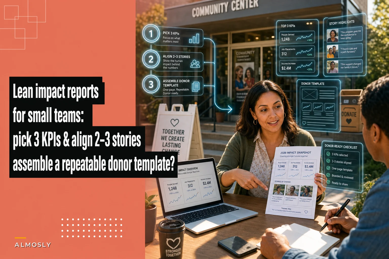

The impact report problem is rarely a writing problem. It's a scope problem. Most small teams sit down to write one and treat it like a research thesis: pull every metric, tell every story, chase every program lead for a quote. Six drafts and three weeks later, they've got a bloated PDF that took the equivalent of a full-time salary to produce and that most donors skim in about 40 seconds.
That gap—weeks of effort for less than a minute of attention—is the whole reason lean impact reports exist. The goal isn't to say less because you're lazy. It's to say the right things in a format you can repeat every quarter without burning out your one grant writer.
This is a three-step process built specifically for teams of one to five people who don't have a data analyst, don't have a designer on staff, and can't afford to let reporting eat a quarter of someone's year.
Why "comprehensive" reports quietly fail small teams
There's a pattern you see over and over in small development shops. The annual report becomes a monster because nobody decided what it wasn't going to include. Every board member wants their pet program mentioned. The ED wants the new strategic priorities in there. Someone insists on including the volunteer hours number even though it's tracked in a spreadsheet that hasn't been updated since March.
So the report expands to fill the available anxiety.
-
15–25 hours of the development lead's time gathering data from mismatched systems
-
Another 8–12 hours chasing program staff for stories and stats
-
Design and layout time, either internal or a freelancer at roughly $600–$1,500
-
Two or three review rounds with leadership, each adding days of lag
Call it 40+ hours plus outside costs, produced maybe once or twice a year. And because it's so expensive to make, teams can't make it often. Which means donors hear about impact once a year, in a giant document, long after they gave.
The lean approach flips the tradeoff. Smaller scope, produced quarterly, at maybe a fifth of the effort. Donors get more frequent proof, and your team gets a process they can actually sustain.
The 3-step lean structure
The entire method comes down to three constraints. Constraints are the point—they're what make the report repeatable.
Stop missing fundraising opportunities.
Almosly helps you plan, track, and optimize every campaign with ease.
- Centralized donor and volunteer management
- Automated engagement workflows
- Impact and fundraising analytics
No credit card required
-
Pick exactly 3 KPIs. Not five, not "the key metrics." Three numbers you can pull the same way every quarter.
-
Align 2–3 stories to those KPIs. Each story should illustrate one of the numbers, not float independently.
-
Drop it all into a fixed donor-facing template so layout decisions happen once, not every cycle.
Step 1: Pick 3 KPIs (and why more is worse)
The instinct is to show donors everything you accomplished. A report with 11 metrics actually communicates less than one with 3, because the reader has no idea which numbers matter.
Pick one KPI from each of these buckets:
| KPI type | What it answers | Example |
|---|---|---|
| Reach | How many people did we serve? | "1,240 meals delivered this quarter" |
| Depth / outcome | Did it actually change something? | "68% of participants stayed housed at 6 months" |
| Efficiency / trust | Are we using money well? | "$14 average cost per meal delivered" |
One number per bucket. Reach shows scale, depth shows the work mattered, efficiency shows you're a good steward. That trio covers what donors actually wonder about without drowning them.
The mistake small teams make here is choosing KPIs based on what's easy to pull rather than what's true and repeatable. If your outcome metric requires a survey you only ran once, it's not a KPI—it's a one-time stat. A real KPI is something you can produce the same way next quarter. If pulling it takes more than an hour, it will quietly get dropped by Q3, and your report loses its spine.
A quick gut check before you lock in a KPI: Can I pull this exact number, the exact same way, 90 days from now, without a special project? If the answer is no, pick a different metric.
Step 2: Align 2–3 stories to the numbers
Stories are where these reports usually go sideways. Someone has a great anecdote about a client, so it goes in—even though it has nothing to do with the three numbers you just featured. Now the reader is holding a report where the data says one thing and the narrative says something else entirely.
The rule: each story exists to make one KPI feel human.
If your depth KPI is "68% stayed housed at 6 months," your story is one person who stayed housed—what the number looks like as a life. If your reach KPI is meals delivered, the story is a single delivery route, a single household, a single volunteer's morning. The story isn't decoration. It's the annotation on the data point.
Two or three short stories is plenty. Each one should be roughly 100–150 words. You're not writing a feature article; you're giving one number a face. In practice, a tight story covers:
-
Who (first name or anonymized) and their situation before
-
What the program did (concretely, not "provided support")
-
Where they are now, tied back to the KPI it illustrates
Longer stories don't perform better in donor reports—they perform worse, because the donor stops reading. The reports that get forwarded and quoted back to you tend to have shorter stories with sharper endings.
One more thing that saves enormous time: keep a running story bank. When a program staffer mentions something good on a call, drop a two-line note in a shared doc with the client's first name and consent status. By the time you're writing the report, you're choosing from ten captured moments instead of frantically emailing "does anyone have a good story?" the week it's due.
Step 3: A fixed donor-facing template
This is the part that turns a one-time effort into a repeatable process. If you redesign the layout every quarter, you've reintroduced all the friction you were trying to remove. Build the shell once.
A lean donor-facing template has five zones, in this order:
-
The headline number — one KPI, big, at the top. The thing you most want them to remember.
-
The three KPIs — clean row or three simple stat blocks. No charts unless a chart genuinely clarifies.
-
The stories — 2–3 short pieces, each visually tied to its KPI.
-
The stewardship line — one sentence that says, plainly, "your gift did this." Donor-facing means you language, not org-facing "we" language.
-
A single next step — how to give again, how to reply, how to reach a human. One ask, not five.
Notice what's not in there: a letter from the ED, a full financials breakdown, a list of every program, a board roster. Those belong in the annual report, not the quarterly lean version. Cutting them isn't a failure of transparency—it's a decision to respect the reader's 40 seconds.
The formatting rule that matters most: donor-facing language throughout. Internal reports say "the program served X." Donor reports say "you helped serve X." That one shift in voice does more for retention than any amount of design polish.
A quick workflow for producing it each quarter
Once the template exists, the actual production cycle should take an afternoon, not three weeks. Here's how it runs:
-
Day 1, morning Pull the 3 KPIs from wherever they live. Because you chose repeatable metrics, this is a lookup, not a research project.
-
Day 1, afternoon Pick 2–3 stories from your story bank. Trim each to roughly 120 words. Confirm consent for any named client.
-
Day 2, morning Drop numbers and stories into the fixed template. Write the one stewardship line and the one next step.
-
Day 2, afternoon One review pass with leadership—and hold the line on scope. The template is the answer to "can we also add…?"
The reason this holds up is that the hard decisions—which metrics, which structure, what voice—were made once, not every cycle. What's left each quarter is filling in a known shape.
Where the right systems actually help is mostly on the data side. If your three KPIs live in a CRM or a program-tracking tool where you can save the same filtered view every quarter, Step 1 collapses from hours to minutes. The teams that struggle are the ones re-deriving numbers by hand from exports each time—slow and error-prone. Any tooling that lets you save a report definition once and re-run it is doing the real work; the writing was never the bottleneck.
Save your KPI queries or filtered views in your CRM so Step 1 is a click, not a project.
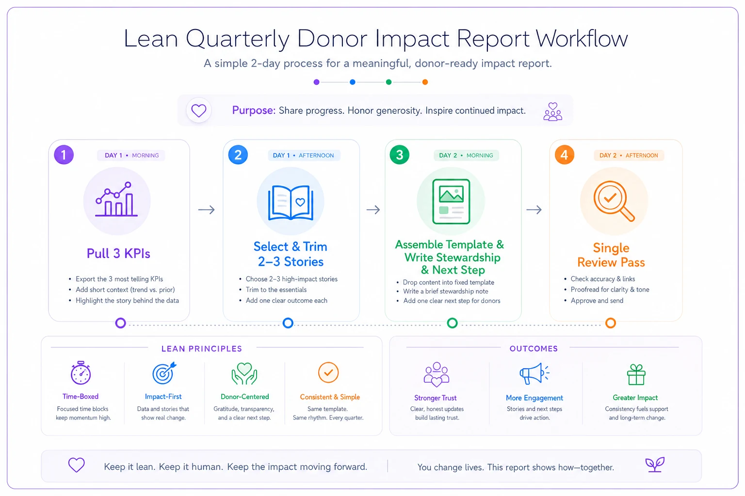
A simple visual like this helps teams remember the four short steps.
Real scenario: a small housing nonprofit
A three-person development team at a housing-stability nonprofit used to produce one big annual impact report. It ran about 16 pages, took the development director roughly three weeks across gathering, writing, and design coordination, and cost around $900 for freelance layout. Donors received it once a year, usually in Q1, covering a year that had already ended.
They switched to the lean quarterly model. Three KPIs: households served, six-month housing retention, and cost per household stabilized. Two stories per report, pulled from a story bank the caseworkers started contributing to. A fixed template built once in their existing design tool.
Production time dropped to roughly half a day per quarter after the first build. Because reports went out four times a year instead of once, donors were hearing concrete proof within weeks of giving rather than a year later. The team didn't track a precise retention lift, but repeat gift response noticeably improved. Maybe more telling: the development director stopped dreading report season, because there wasn't one anymore. It just became routine.
When lean reports make sense—and when they don't
This works well when:
-
Your team is small and reporting currently eats disproportionate time
-
You have a handful of metrics you can pull consistently
-
Your donors are individuals and mid-level givers who want proof, not a research document
This is a bad fit when:
-
A specific funder requires a detailed grant report with defined fields. Lean reports don't replace compliance reporting—they run alongside it.
-
Your metrics aren't stable yet. If you're still figuring out what to measure, lock that down first before committing to a repeatable format.
-
You genuinely have no consistent data source. If pulling even three numbers is a scramble every time, fix the data foundation before the reporting cadence.
Who should skip this entirely: organizations whose entire funding base is a few large institutional grants with rigid reporting templates. Your effort is better spent nailing those specific formats than building a separate donor-facing cadence.
The mistake that undoes the whole thing
The failure mode isn't producing a bad report. It's scope creep back to comprehensive.
Quarter one, you ship a tight three-KPI report and everyone loves it. Quarter two, a board member asks to add the volunteer program. Quarter three, someone wants a financials chart. By quarter four you're back to a bloated document that takes three weeks, and you've quietly killed the thing that made it sustainable.
Protect the constraints like they're the product—because they are. The value of a lean report isn't just what's in it. It's the discipline of what you agreed to leave out. Three KPIs, two or three aligned stories, one fixed template. Keep those locked, and you'll produce impact reports your donors actually finish reading, on a cadence your team can actually sustain.
Protect the constraints like they're the product—because they are. The value of a lean report isn't just what's in it. It's the discipline of what you agreed to leave out. Three KPIs, two or three aligned stories, one fixed template. Keep those locked, and you'll produce impact reports your donors actually finish reading, on a cadence your team can actually sustain.
Ready to elevate your nonprofit impact?
Join 2,000+ nonprofits using Almosly to boost fundraising efficiency, deepen donor relationships, and scale philanthropic impact.